Key Takeaways
- A single pane of glass isn’t valuable if engineers still have to search for answers.
- Displaying all your data in one place is not the same as providing meaningful operational insight.
- The best monitoring platforms connect related information instead of forcing users to correlate it manually.
- Ideally, your platform should provide customizable, shareable dashboards that are specific to the role or the use case.
- Effective monitoring reduces the time between an alert and a solution by providing context, not just visibility.
- Success should be measured by how quickly engineers can resolve problems, not by how many dashboards they can consolidate.
For years, “single pane of glass” has been one of the most popular phrases in IT.
Every monitoring platform seems to promise it.
One dashboard.
One interface.
One place to see everything.
It sounds exactly like what every IT team wants.
Until they actually get it.
Because having all your data in one place doesn’t necessarily make it useful.
Visibility Isn’t the Same as Understanding
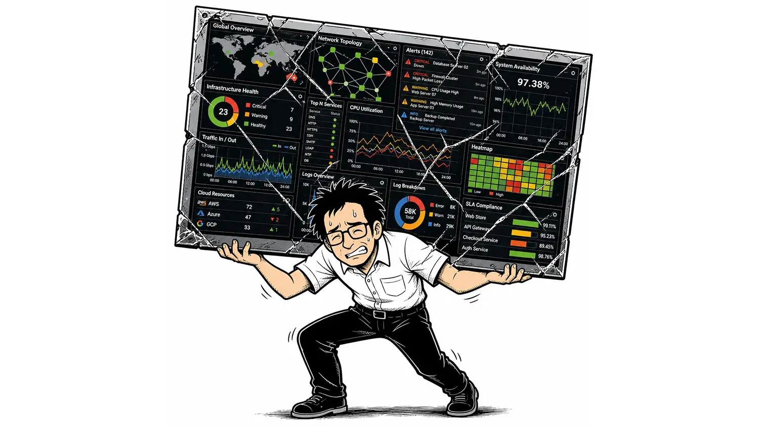
Imagine walking into a room where every server metric, network graph, firewall alert, cloud dashboard, virtualization statistic, syslog message, and application metric is displayed on giant screens.
Congratulations.
You’ve achieved a single pane of glass.
Now answer this question.
Why is the accounting department unable to access the ERP system?
Suddenly, having everything visible doesn’t feel nearly as helpful.
The challenge was never seeing the data.
The challenge was understanding it.
More Information Can Create More Work
Technology vendors often equate consolidation with simplicity.
In reality, they’re not the same thing.
Combining ten dashboards into one doesn’t automatically reduce complexity.
Sometimes it simply moves the complexity into a larger dashboard.
Engineers still need to determine:
- What changed?
- Which alerts matter?
- Which systems are related?
- Where should I start?
If those questions remain difficult to answer, the interface may be unified, but the experience isn’t.
Context Is What Engineers Actually Need
When something goes wrong, engineers rarely care about every metric.
They care about the ones connected to the problem they’re trying to solve.
If an interface becomes saturated, they want to know:
- Which applications are using the bandwidth?
- Which users are affected?
- Which devices are connected?
- Has this happened before?
- Did any related alerts occur at the same time?
Those answers don’t come from simply placing more charts on a dashboard.
They come from connecting the data behind those charts.
Monitoring Should Guide the Investigation
Think about how experienced engineers troubleshoot.
They don’t randomly click through dashboards.
They follow clues.
One alert leads to another.
One graph explains another.
One event points toward the root cause.
Your monitoring platform should support that process.
Every click should reveal more context, not another disconnected screen full of metrics.
The best monitoring systems don’t just display information.
They guide investigations.
A Dashboard Should Reduce Decisions
Every incident begins with uncertainty.
Where do I start?
What’s affected?
Is this isolated?
How serious is it?
Good monitoring platforms answer those questions immediately.
Poor monitoring platforms require engineers to answer them on their own.
That’s an important distinction.
A dashboard shouldn’t increase the number of decisions an engineer has to make.
It should eliminate as many of them as possible.
Correlation Beats Consolidation
Suppose you receive an alert that a core switch is experiencing unusually high CPU utilization.
A traditional dashboard might require you to open several additional views to investigate.
Performance graphs. Interface utilization. NetFlow. System logs. Topology. Configuration history.
Eventually, you’ll piece together the story.
A better monitoring platform starts connecting those pieces immediately.
Related alerts.
Traffic spikes.
Interface changes.
Historical behavior.
Device relationships.
Instead of asking engineers to assemble the puzzle themselves, the platform begins laying out the picture.
That’s the difference between consolidation and correlation.
The Best Interfaces Feel Smaller
This might sound backwards.
The best monitoring platforms often feel like they show less information.
That’s because they prioritize the information that matters most.
Healthy systems quietly fade into the background.
Anomalies rise to the surface.
Related information appears together.
The interface feels simpler because the platform is doing more of the work behind the scenes.
The Right Dashboard Depends on Who’s Looking
One of the biggest misconceptions about the “single pane of glass” philosophy is that everyone should be looking at the same dashboard.
In reality, different people ask different questions.
A network engineer wants to see interface utilization, topology changes, packet loss, and device health.
A systems administrator cares about servers, storage, virtualization, and application performance.
A database administrator wants visibility into database availability, performance, and capacity.
An executive doesn’t need hundreds of technical metrics. They want to know whether critical business services are healthy and whether customers are being impacted.
An MSP may need entirely different dashboards for every customer they support.
Trying to squeeze all of those perspectives into a single dashboard usually creates one thing:
A dashboard that isn’t ideal for anyone.
That’s why Lumics takes a different approach.
Instead of forcing every user into the same view, Lumics allows you to create as many dashboards as you need, each tailored to a specific audience, responsibility, or use case.
For example, organizations commonly build dashboards for:
- A large-screen Network Operations Center (NOC) displaying real-time network health and active alerts.
- Network engineering teams focused on switches, routers, firewalls, wireless infrastructure, and WAN connectivity.
- Infrastructure teams responsible for servers, virtualization platforms, storage, and operating systems.
- Database administrators monitoring the health and performance of critical database platforms.
- Executives who need a high-level view of service availability, uptime, and business-critical systems.
- Managed Service Providers (MSPs) that publish customer-specific dashboards, including externally accessible dashboards that clients can view anytime without contacting the help desk.
Each dashboard presents the information that matters most to its audience, without overwhelming users with metrics they don’t need.
That’s not multiple versions of the truth.
It’s the same data presented in the context that’s most meaningful to the person making decisions.
The goal was never one pane of glass.
The goal is to give every stakeholder the clearest possible view of the information they need to do their job.
Measure Outcomes, Not Dashboards
Instead of asking:
“Can we see everything from one screen?”
Organizations should ask:
- Can engineers identify problems faster?
- Can they determine the root cause more quickly?
- Can they reduce downtime?
- Can new team members troubleshoot effectively?
- Can incidents be resolved with fewer clicks?
Those are the measurements that actually improve IT operations.
Nobody remembers how many dashboards they consolidated.
Everyone remembers how quickly the outage was resolved.
The Bottom Line
The idea of a single pane of glass isn’t wrong.
It’s just incomplete.
Visibility is important.
But visibility without context simply shifts the burden onto the engineer.
Modern monitoring should do more than collect information from across the infrastructure.
It should connect that information in meaningful ways, surface what’s important, and guide engineers toward the answer instead of expecting them to build it themselves.
At Lumics, we believe the goal isn’t to create one place to see everything.
It’s to create one place where everything makes sense.
Because the fastest way to solve a problem isn’t seeing more data.
It’s understanding the right data.