Fast Accurate Graphs
TL;DR
One of the most powerful and unique features of Lumics is our wicked fast data graphing.
Lumics stores data longer than most of our competitors, and our graphs can access and visualize historical data almost instantly.
All our competitors use graphing frameworks that use data “averaging” which can result in bad data and missed events, but Lumics created a min/max graphing methodology to solve this.
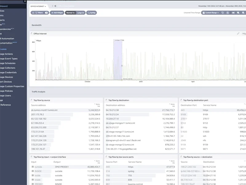
Lumics graphs make it super easy to drill down on specific details very quickly.
Lumics graphs sync with each other on our dashboards, so when you zoom in on one specific graph, the others update to that same timeframe.
Lumics graphs are not just for visual monitoring, but are also extremely useful for quick troubleshooting.
Wicked Fast
Lumics’ unique and incredibly fast graphing capability is one of the most-loved and talked about features. Some customers have switched from other monitoring tools to Lumics for this capability alone.
Almost any critical information for troubleshooting is available within two or three clicks because of the way various data points can be combined together on our customizable dashboards using our flexible and resizable widgets.
Lumics can quickly access and display historical data, even data from years ago, making it very easy to find the information you need.
Min/Max vs Averaging
Most graphing tools or frameworks used by our competitors are based on data averaging over specific time periods. The larger the time period, the more the data is “averaged” to show a graph of that data. This process often renders the graphs somewhat inaccurate or misleading, especially when trying to identify specific events or points in time that are anomalies compared to the rest of the graph data.
Working with an Oxford scholar with a PhD in advanced mathematics, Lumics developed a graphing solution that captures every data point and displays the min and max valleys and peaks as accurately as possible – not just for real-time data, but historical data as well.
This means you’ll never miss a critical event, even if it’s a small anomaly in the data, and when reading the graphs you won’t misinterpret what you’re seeing (and therefore take incorrect actions based on that data).
"Lumics is so fast!"
"Lumics has been a game changing product."
"The data is very actionable."
"Rare among current monitoring tools."
"Engineers can be engineers and not monitoring tool administrators"
"We can monitor thousands of devices with one tool…it just works!"
"The granular data Lumics provides is a game changer!"
"It runs super quickly."
"Lumics provides all the insights we need to make quick operational decisions."
Drill Down
Lumics graphs every data point we ingest, and graphs are instantly accessible from the corresponding data point or widget on the Lumics dashboards.
Click on any data point in a widget to immediately see it’s associated graph. Scroll or click to jump forward or backward in time. Click and drag across the graph to reset the viewable timeframe (zooming in on a specific segment). All of the other widgets on the dashboard automatically stay in sync with any of these actions so you can quickly see what was going on in related areas of your system for the specific time period you’ve zoomed into on any given widget.
Search for any data point instantly using the filter bar on any widget. Lumics displays all data points associated with a particular widget in ascending or descending order, and colors and bar graphs show which data points are critical or most interesting compared to the others.
Quick Troubleshooting
Because of the speed with which Lumics can analyze and graph data, plus the time-synced intelligent widgets on a dashboard, AND the ability to combine various monitoring data points from various sources in a single view (netflow, syslog, SNMP, etc) – the “single pane of glass” concept – is it very easy to get to the root cause of any problem within a few clicks.
No need to run lengthy reports and wait. No need to look at many different tabs and connect the dots between the data manually. No need to go down multiple data rabbit holes that are dead ends. And you can control and eliminate much of the false-alarms or noise that other systems tend to generate.