Key Takeaways
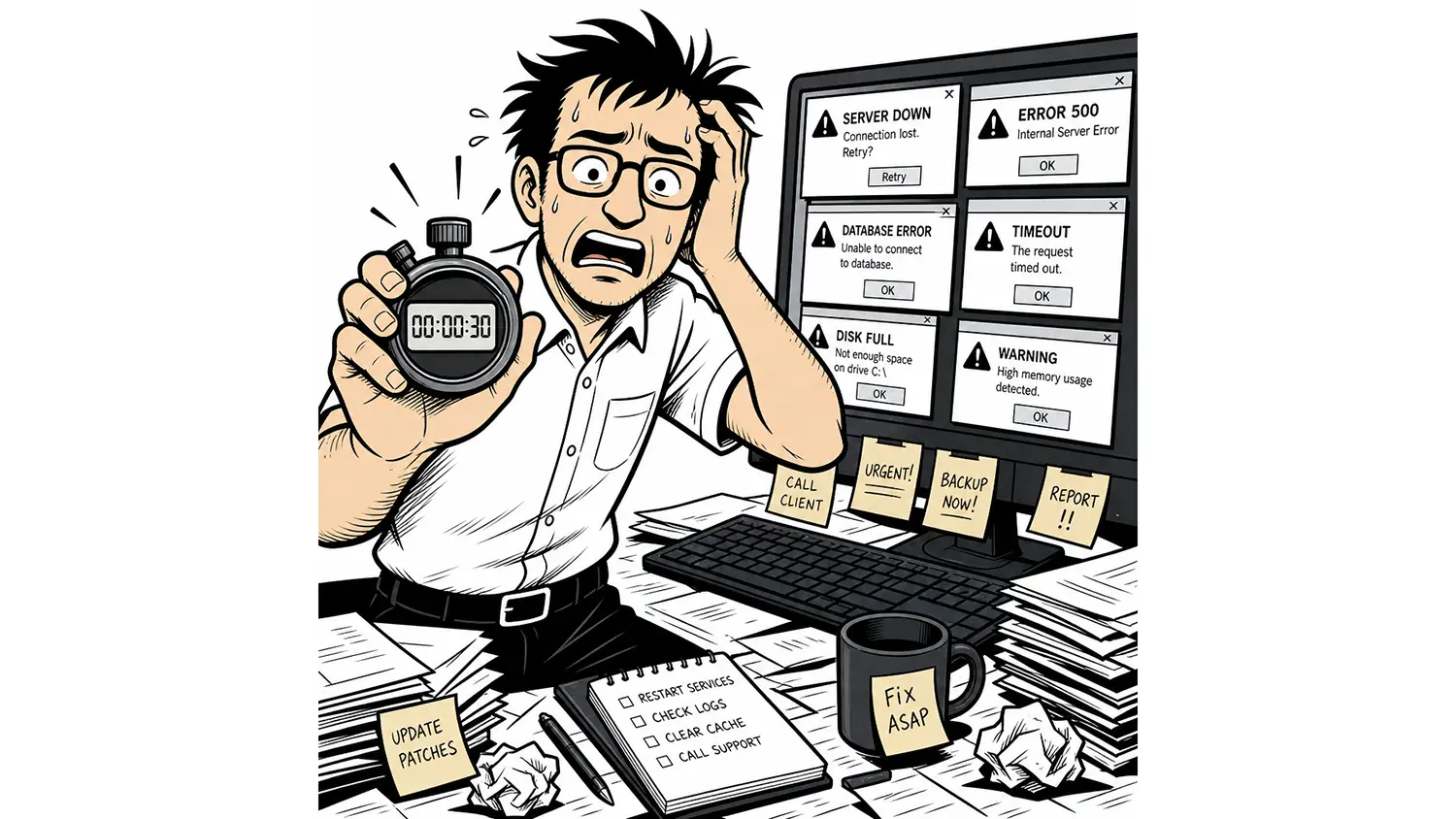
- A dashboard should answer your most important operational questions in 30 seconds or less.
- Displaying more metrics doesn’t create more value if engineers can’t quickly identify what’s important.
- Good dashboards prioritize context, clarity, and action over visual complexity.
- The best monitoring dashboards help engineers make decisions instead of simply displaying data.
- When dashboards reduce time-to-insight, IT teams troubleshoot faster and spend more time improving their infrastructure.
Monitoring dashboards have become the command center of modern IT operations.
Or at least, that’s what they’re supposed to be.
Open almost any monitoring platform, and you’ll find colorful graphs, gauges, heat maps, status indicators, tables, widgets, and charts covering nearly every inch of the screen.
It certainly looks impressive.
But here’s the real question:
Can an engineer look at that dashboard for 30 seconds and know whether the environment is healthy?
If the answer is no, the dashboard isn’t doing its job.
Dashboards Should Create Clarity
Many dashboards are designed to display information.
Far fewer are designed to communicate it.
Those are very different goals.
Displaying information is easy.
Communicating what matters requires prioritization.
A good dashboard immediately tells you:
- Is anything broken?
- What changed?
- What requires my attention right now?
- Where should I start?
If an engineer has to click through multiple screens before answering those questions, the dashboard has already failed.
More Widgets Don’t Make a Better Dashboard
It’s tempting to believe that more information creates more visibility.
In reality, the opposite is often true.
Every additional graph competes for attention.
Every new widget adds visual noise.
Every unnecessary metric increases the amount of information engineers must process before they can identify what’s actually important.
Eventually, the dashboard becomes less like a control center and more like the cockpit of a commercial airliner.
Everything is available.
Finding the one thing that matters takes far too long.
Engineers Don’t Need More Data
They Need Better Context
Imagine opening your dashboard and seeing that CPU utilization has reached 92%.
Should you worry?
Maybe.
Maybe not.
Without context, that single number tells you very little.
Now imagine seeing:
- CPU utilization increased dramatically in the last five minutes.
- Memory usage remains stable.
- Network traffic doubled.
- NetFlow shows a backup job consuming most of the bandwidth.
- Users have not reported any service degradation.
That’s a completely different picture.
The dashboard hasn’t simply displayed data.
It’s helped you understand the situation.
That’s the difference between monitoring and decision support.
The Best Dashboards Highlight Exceptions
Healthy infrastructure should almost disappear into the background.
Your dashboard shouldn’t force you to inspect every green checkmark.
It should draw your attention to what changed.
Experienced engineers naturally look for anomalies.
A dashboard should do the same.
Instead of making users search through hundreds of healthy devices, it should immediately surface the handful of systems that deserve attention.
Good dashboards answer the question:
“What’s different today?”
Not:
“Here’s everything that’s running.”
Every Click Adds Time
One of the highest hidden costs of poor dashboard design is navigation.
Click into a device.
Open another graph.
Switch to a topology map.
Open a historical report.
Return to the dashboard.
Repeat.
None of those clicks solves the problem.
They’re simply the cost of finding the information needed to solve it.
Over the course of a day, those extra clicks add up to hours of lost productivity.
Good monitoring platforms minimize the distance between an alert and an answer.
Dashboards Should Tell a Story
The most effective dashboards don’t overwhelm users with isolated metrics.
They connect the dots.
When latency increases, they show which links are affected.
When an interface becomes saturated, they make it easy to identify the applications driving the traffic.
When a device goes offline, they help engineers understand what services and users might be impacted.
Every piece of information adds context to the next.
The dashboard becomes a narrative instead of a spreadsheet.
Simplicity Is a Feature
Some people mistake simple dashboards for limited dashboards.
In reality, simplicity is often much harder to achieve.
It requires deciding what not to show.
It requires understanding which metrics matter most.
It requires designing for the engineer who has just been pulled into an incident and needs answers immediately.
Simple doesn’t mean basic.
Simple means intentional.
Put Your Dashboard to the Test
Here’s a simple exercise.
Open your primary monitoring dashboard.
Set a timer for 30 seconds.
Without clicking anywhere, ask yourself these questions:
- Is my environment healthy?
- What changed recently?
- What needs immediate attention?
- Where should I begin investigating?
If those answers aren’t obvious, your dashboard is probably creating more work than it’s removing.
The Bottom Line
Dashboards aren’t built to impress visitors.
They’re built to help engineers make faster, better decisions.
Every graph, chart, and widget should earn its place by helping someone understand what’s happening right now.
If it doesn’t contribute to that goal, it’s probably adding noise instead of value.
At Lumics, we believe the best dashboards don’t try to show everything.
They show the right things at the right time, making it easy for engineers to move from awareness to action without wasting valuable time searching for answers.
Because in IT operations, the faster you understand the problem, the faster you can solve it.