Key Takeaways
- Averaged data can hide the short-lived spikes that often signal the beginning of a performance problem.
- Min/max graphing exposes anomalies that traditional average-only charts smooth away.
- Engineers make better decisions when they can see what actually happened, not just the mathematical average.
- Preserving data extremes provides a more accurate picture of network behavior over time.
- Better data leads to faster troubleshooting, fewer blind spots, and greater confidence in your monitoring platform.
Open almost any network monitoring platform and you’ll see graphs.
Bandwidth utilization.
CPU usage.
Memory consumption.
Latency.
Packet loss.
They’re clean.
They’re colorful.
And in many cases, they’re hiding the most important information.
The problem isn’t the graph itself.
It’s the data behind it.
The Problem with Averages
Most monitoring platforms collect thousands of data points throughout the day.
Displaying every one of those measurements would quickly become impractical, so many platforms simplify the data by averaging it together.
At first glance, that seems perfectly reasonable.
After all, averages make charts easier to read.
The problem is that networks don’t fail on average.
They fail during spikes.
A Simple Example
Imagine an interface that runs at 10% utilization for four minutes.
During the fifth minute, traffic suddenly jumps to 100% as a large backup job, ransomware attack, or broadcast storm floods the network.
One minute later, utilization returns to 10%.
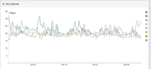
Many monitoring platforms would average those six minutes into a single value.
Instead of showing a brief but critical spike to 100%, the graph might display something closer to 25%.
Looking at the chart later, nothing appears unusual.
The event that engineers actually needed to investigate has effectively disappeared.
Mathematically, the graph is correct.
Operationally, it’s misleading.
VS
The Biggest Problems Often Last Only Seconds
Many infrastructure issues are surprisingly brief.
An interface briefly saturates.
A routing protocol reconverges.
A firewall CPU spikes.
A storage array experiences a short burst of latency.
A virtual host becomes overloaded for thirty seconds.
These events may not last long enough to noticeably affect the average.
But they’re exactly the kinds of anomalies engineers need to investigate.
They’re often the first warning signs that something bigger is developing.
When those spikes disappear from the graph, so do valuable troubleshooting clues.
Why Min/Max Graphing Matters
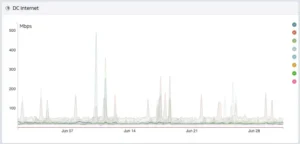
Instead of storing only an average value, Lumics preserves the minimum and maximum measurements collected during each time interval.
That means every graph tells a more complete story.
Instead of seeing a smooth line that suggests everything was normal, engineers can immediately recognize that something unusual occurred, even if it lasted only a few seconds.
The average still has value.
But it shouldn’t be the only story your data tells.
Networks Aren’t Smooth
Average-only graphs often give the impression that networks behave in smooth, predictable patterns.
Anyone responsible for a production environment knows that’s rarely true.
Users log in.
Applications update.
Cloud workloads scale.
Backups begin.
Video meetings start.
Large files are transferred.
Traffic constantly changes.
Your graphs should reflect that reality.
When they don’t, engineers are forced to troubleshoot with an incomplete picture.
Better Data Leads to Better Questions
One of the biggest advantages of min/max graphing isn’t simply spotting spikes.
It’s asking better questions.
Why did latency briefly double?
What caused CPU utilization to peak?
Why did bandwidth hit capacity for thirty seconds every afternoon?
Those questions rarely arise from a perfectly smooth graph.
They come from seeing the anomalies.
And anomalies are often where the most valuable troubleshooting begins.
Historical Data Should Preserve History
Monitoring platforms are designed to help engineers understand what happened.
Unfortunately, aggressive data averaging can unintentionally rewrite history.
A graph viewed one day after an incident may look completely different from the graph viewed a month later.
Not because the network changed.
Because the historical data was consolidated into averages.
Over time, the evidence gradually disappears.
Engineers investigating intermittent problems are left wondering whether the event actually happened at all.
Historical data shouldn’t become less truthful simply because it gets older.
Better Decisions Start with Better Visibility
Imagine two engineers investigating the same complaint.
One sees a perfectly smooth bandwidth graph averaging 35% utilization.
The other sees that utilization briefly reached 98% several times during the user’s reported outage.
Which engineer reaches the answer faster?
The difference isn’t experience.
It’s visibility.
When engineers can see both the normal operating pattern and the important exceptions, they spend less time guessing and more time solving the problem.
Seeing the Full Picture
No single metric tells the whole story.
That’s why effective monitoring combines multiple perspectives.
Average values help identify long-term trends.
Minimum values reveal periods of low activity.
Maximum values expose the bursts, spikes, and anomalies that often matter most.
Together, they provide a much more accurate representation of how your infrastructure actually behaves.
The Bottom Line
Monitoring isn’t just about collecting data.
It’s about preserving the information that helps engineers understand what really happened.
Averages have their place, but they shouldn’t come at the expense of the events that matter most.
When short-lived spikes disappear from historical graphs, troubleshooting becomes slower, intermittent issues become harder to explain, and engineers lose confidence in the data they’re relying on.
At Lumics, we believe monitoring should reflect reality, not smooth it away.
That’s why our min/max graphing preserves the peaks and valleys that other platforms often hide, giving engineers a clearer picture of network behavior and the confidence to investigate problems before they become outages.